Brand Guidelines
Naming Guidelines
Principles
- We would like to keep our names simple, easy to remember, and understood.
- We want to make our text short as possible. For this reason, we prefer short names.
- We would like to take our priviledge to make use of UN brand where appropriate. On the other hand, we want to be considerate not to assume the name of the UN. We do not want anyone to feel cheated.
Guidelines
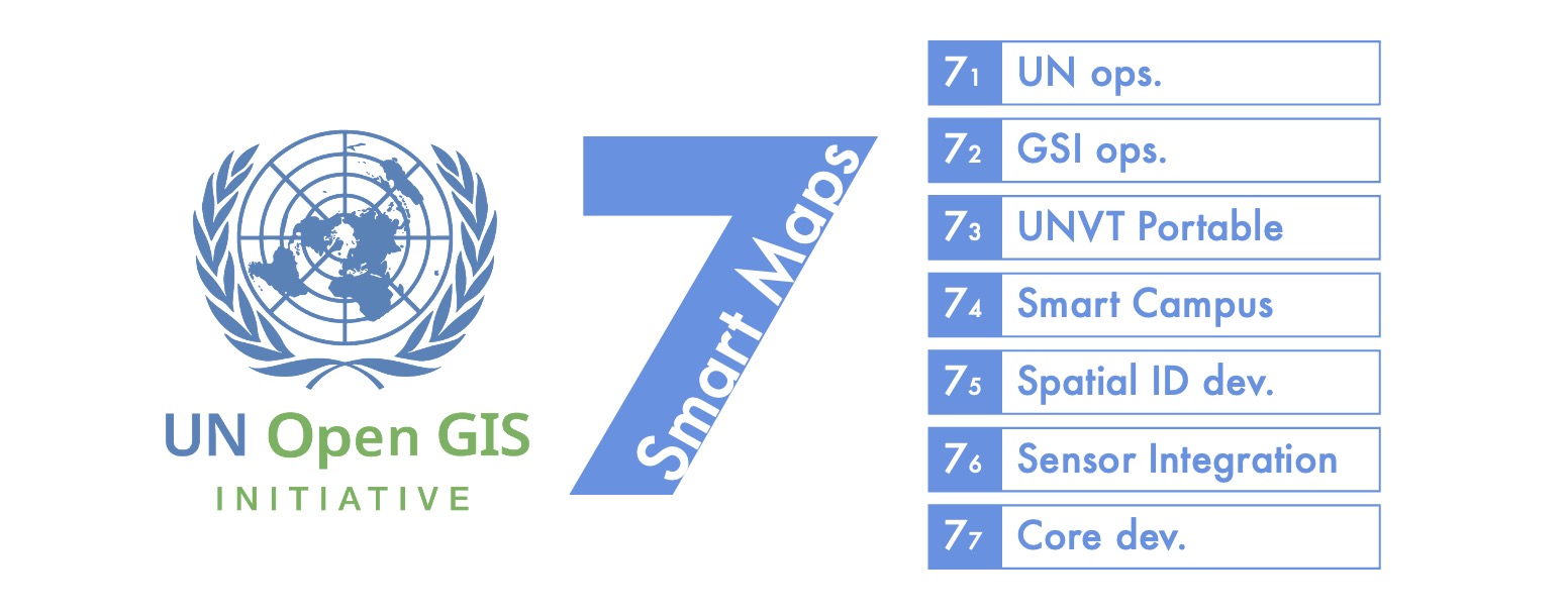
- We normally use UN Smart Maps when it is appropriate. We want to use this as our standard brand.
- Sometimes we simply say Smart Maps as nickname in some casual and friendly context.
- We add specific words after Smart Maps to identify something under our activitiy. For example: Smart Maps Meetup, Smart Maps Bazaar, Smart Maps Group, and maybe Smart Maps Portable in future. It is OK to use UN as a prefix. However, we also wanto to keep our names short, preferably less than 4 words.
- We always use Maps in plural form. We do not use Smart Map in singular form.
- We also add DWG and 7 when it is necessary or appropriate. But we still want our brand simple and easy to remember. That is why we normally use UN Smart Maps.
- In Japanese language, 国連スマート地図 would be our standard brand.
UN Smart Maps Color Scheme
| Color Name | Color Preview | RGB | Hex | Description |
|---|---|---|---|---|
| Smart Blue | rgb(92, 129, 184) | #5c81b8 | Represents innovation, clarity, and the open exchange of knowledge and resources within our community. | |
| Collaboration Green | rgb(151, 190, 132) | #97be84 | Signifies the spirit of cooperation and unity within our community. | |
| Innovation Red | rgb(222, 129, 129) | #de8181 | Embodies our commitment to innovation and forward-thinking practices in geospatial technology. |
The UN Smart Maps Color Scheme is comprised of three key colors: Smart Blue, Collaboration Green, and Innovation Red. Each color is carefully selected to visually represent the values and principles of the UN Smart Maps Group and its initiatives, fostering a sense of identity and unity within our community while facilitating recognition of our work and objectives.
-
Smart Blue: Smart Blue (RGB: rgb(92, 129, 184), #5c81b8) represents the intelligent and sophisticated approach of the UN Smart Maps group. It symbolizes innovation, clarity, and the open exchange of knowledge and resources within our community.
-
Collaboration Green: Collaboration Green (RGB: rgb(151, 190, 132), #97be84) signifies the spirit of cooperation and unity within our community. It reflects our commitment to working together across diverse backgrounds and disciplines to achieve common goals and address global challenges.
-
Innovation Red: Innovation Red (RGB: rgb(222, 129, 129), #de8181) embodies our commitment to innovation and forward-thinking practices in geospatial technology. It represents our willingness to embrace new ideas, methodologies, and technologies to improve decision-making and drive positive change worldwide.
These colors, Smart Blue, Collaboration Green, and Innovation Red, together constitute the UN Smart Maps Color Scheme. They are integral to our visual identity and are utilized across various platforms to represent our organization and its mission effectively.
Typefaces
The UN Smart Maps brand uses the following typefaces:
- Futura for headings
Provisonal logo

Provisional social preview image
v2.1
v2.0